Key Principles To Build an Eye-Catching Design System (+ Best Examples)
Last updated:27 October 2021
In this article, you can discover tips on how to build a design system for your software product and explore the best design system examples.
A well-thought-out design system facilitates the work of development and design teams and opens the door to cooperation as one mechanism. One that includes every detail, from the buttons to entire pages, helps to reach the goal faster, dramatically saves time and other resources.
This article explains in simple words what it is and how to build a design system, why it shouldn't be considered as a guide or a brand book, why companies need it, how to use them, and what are the best cases to take as examples.
What is a Design System?
In a nutshell, a design system is a collection of documents, articles, code snippets, screenshots, guidelines, components, and other digital assets that UI/UX design and development companies use. It's usually hosted online as a website and can be open for everyone or internal.
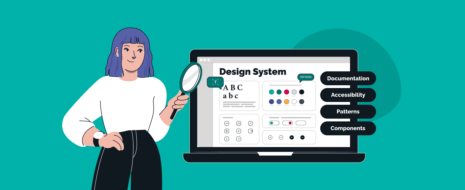
A design system is an extensive database broken into categories: documentation, visual elements, recommendations, and references. It can and should be scaled, improved, and supplemented with new components.
If it still sounds like the usual guideline to you, we'll debunk this idea right away. The style guide includes tips or tricks for visual design: color, font, logo, and more. The design system, in turn, consists of much more. Here we can find recommendations for style, tone of voice, brand positioning, bits of advice for collaborations, and advertising. One of the main principles of the design system is being holistic and covering every single detail.
Design System Development: Main Steps
The design system creation process differs for each company since there are influencing factors: the presence of the system design being or used to be in use, variety of elements, their types, etc. The design system for startups will differ from the one for enterprises. These factors, in turn, rely on business characteristics and objectives.
If we try to generalize, the process of creating a design system can be divided into four main stages: visual audit, design language development, pattern library creation, maintenance, and support.
Visual Audit
Before going to elements, you start building a design system with careful analysis of the data you already have. Clearly define the objectives of every element, its role. Most likely, you'll come up with ones related to interface, style, documentation, etc.
If you need a design system for an existing product, start collecting and grouping all the current components. First of all, it will give you a base and a place to start, and secondly, the chance to understand what to delete, what to modify, and what should be considered a piece of crucial information.
All these decisions are matched against available resources and goals.
Visual Design Language System Creation
Here we are talking about everything concerning the visible part of the product: colour, graphics, typography, etc. Let's walk through the main ones in more detail.
- Colour
Describe the colour scheme, and determine the primary and secondary colours, including all their shades and hues. Prescribe which of them should be used for which element.
Pay extra attention to the contrast since it copes with highlighting every single element, helps to group them and improves the user experience.
This section will and should be supplemented and slightly changed; you'll add new elements since the product will scale. And using a design system will significantly improve UI / UX and speed up the work.
- Typography
Typography is a critical element of any design system. This section includes name, size, height, colour, weight, spacing, etc. Indicate which typography needs to be applied to the specific elements and whether it matches their purpose. Nothing helps to set the accents better.
When considering fonts, remember their purpose - to maintain a hierarchy of elements, distinct accents, carry information in the correct sequence, and preserve and enhance the recognizability of the product.
- Sizing and Arrangement
Here we work with the placement of all elements, indents, alignment, lines, white space, etc. Proper arrangement significantly affects the UX and, subsequently, the achievement of the aims and goals of the website and the product itself.
- Graphics
Describe in detail all graphic elements: size, proportions, recommendations and prescriptions, messages they should broadcast, and so on.
"The best thing about having the design system is that the developer works with components. And if there is the need to change all similar ones, a color of some button, for example, there's no need to do this manipulation with every single button. You change one, and all related components will be changed in a matter of a few clicks."
Library Creation
Having this done, you can create the library itself. Start with cutting extra details and elements, combine all collected and generated information and materials, and draw conclusions. Pay attention to the following to-dos:
-
Notify developers. All of them who work or will work with the library need to know about the update immediately. Everyone should be aware of even the most minor changes; they can significantly impact their work.
-
Share the library with all developers. When needed, any employee should use the library and find or check the required information.
-
Convert elements into code. This will significantly speed up the work of developers and contribute to the further growth of the product. As it's been said, tens and hundreds of elements can be changed in parallel if you work with a design system.
-
Write a detailed explanation. It applies to the design system as a whole and every single element. Ensure the primary function - to simplify and speed up the work - is achieved. This information will also be helpful during the onboarding of new employees.
an HR tech app that was acquired by StepStone
Main Mistakes in Design System Development
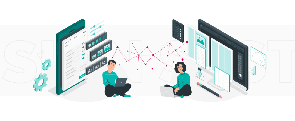
A well-thought-out and accurately created design system work as a bridge between designers and developers, linking them and facilitating their work. Nonetheless, even knowing how to build a design system, there are some mistakes commonly made. The most problems appear when creators:
-
Make a system too complicated. The better option is to focus on scalability since small and simple elements can be folded into more complex ecosystems. Once created with this approach, a design system becomes easy to work with. And, logically, the chances of using a maximum number of elements become greater.
-
Focus on elements but not their mission. As it's been said, the point of creating a design system is not just having it but applying it to work; it’s one of the design system principles. Detailed explanations, descriptions, and tutorials are necessary.
-
Ignore feedback. No one knows better what the design system should look like and work like than people that use it. Get feedback and recommendations, use them in the next iteration. Every time questions or doubts arise - catch up with the developers and designers.
-
Ignore basic principles of design. Arrange the meeting, define and write them down, dividing them into short-term and long-term perspectives, vital and optional, etc. Thus, you'll have pillars holding your design system and the basis for future work.
The best design systems
1. Google Material Design System
Alongside Amazon, Apple, and Microsoft, Google is one of the Big Four technology companies. In many fields, it's a synonym of high quality and excellent organization of processes.
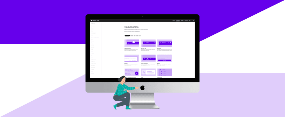
Their publicly shared [Material Design System](https://m3.material.io/) also illustrates the exceptional attention to detail: categorized and catalogued components in a way the design world has never seen before. They gave order and meaning to the atomic design principles that all design systems are built on today.
Their main goal was to create a visual language that would mix the classic principles of good design with technology and science innovations. Material Design System's main features are layout, colour, typography, components, material theming, design source files, and more. You can easily download files for design software like Sketch and Figma.
2. Apple Human Interface Guidelines
Elegant and recognizable design is what we love Apple for and what makes people want every new "iAnything" before it was launched. [Apple's Human Interface Guideline](https://developer.apple.com/design/human-interface-guidelines/) is an incredible resource full of downloadable templates, elements and UI design principles that you can use in your projects.
Apple Human Interface Guidelines features best practices, numerous guidelines for developers, designers, and distributors. You can easily download a wide variety of resources and tools and use them in your work. Those are design files, mockups, code snippets, references, and how-tos. It could change your digital visions dramatically.

3. Uber Design System
Uber is a worldwide known taxi (and not only) service and a part of the gig economy, which means it's working for both passengers and drivers. Uber offers services that include point-to-point ridesharing, ride-service hailing, food delivery (Uber Eats), passenger transport (Uber Shuttle), and a micro-mobility network with electric bikes and scooters.
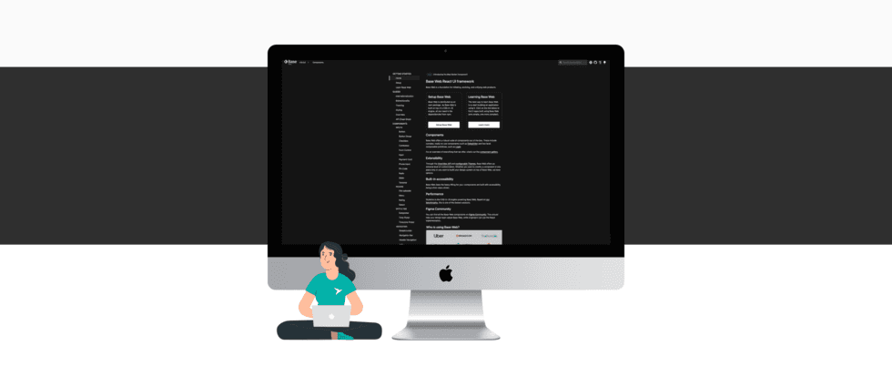
From the very beginning and to the whole, Uber is all about giving people an opportunity to get to the needed place fast and smoothly. Striving to comfort is easy to read in every element of their design system and its concept. [Uber Design System](https://www.uber.com/en-EE/blog/introducing-base-web) BaseWeb includes brand architecture, visual components, tone of voice, composition, and other features.
4. Shopify Polaris
Shopify is a worldwide known all-in-one e-commerce platform created to help people start, run, and grow businesses. As we write, it powers [over a million firms worldwide](https://www.nasdaq.com/articles/shopify-just-made-a-huge-move-to-boost-its-international-sales-2021-09-26). It applies to companies of all sizes and doesn't have any field or industry limits.
At Shopify, they believe there is a lot of space for fantasy and work to make commerce more convenient and accessible to people and businesses. They aim to help everyone achieve independence by making starting, running, and growing a business as easy as possible. As they say, they constantly work on recharging their users' trust batteries and want people to feel comfortable using their products, whether it's their first experience or hundredth.
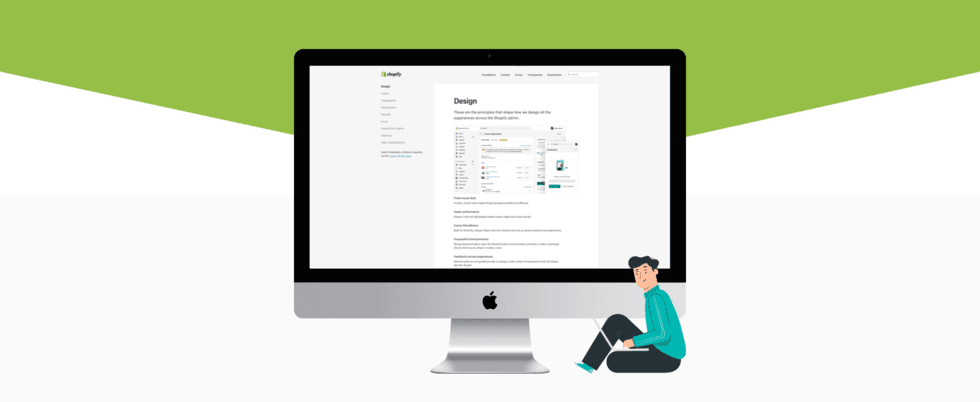
The easiest way to benefit from [Shopify's design system](https://polaris.shopify.com/) is to use it as a practical guide that helps you understand how to design specifically for the Shopify platform. Moreover, it grants knowledge and inspiration for using language, content, visual elements, and UI components. Having and using this, you deliver better product experiences for any eCommerce-related project. Shopify Design System itself is an example of a beautiful design.
5. Salesforce Lightning Design System
Salesforce pioneered cloud-based CRM software and has helped over 150,000 companies run effectively and smoothly. They deliver personalized experiences through integrated CRM systems enhancing marketing, sales, and service.
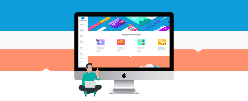
The [Salesforce Lightning Design System](https://www.lightningdesignsystem.com/) is a great one to take as an example if you work on content management systems, AI, sales, commerce, or analytics platforms development. This design system is all about improving user experience, interactions, and flows. The main features are essential, but what catches the attention is a massive number of small components, which means constant improvement and attention to details, even the tiniest.
Final thoughts
Work on the design system always remains ongoing. According to new demands, trends, and feedback from designers, developers, and users, the UX design system and the UI design system includes constant improvement, adjustment, and supplementation. But once implemented, it sets the course and puts limitations within this course. That is why a solid and development-oriented design system should be scalable and grow together with the product.
Each page, screen, component, and element have a unique purpose and goal you can't neglect. A design system describes principles and approaches to design and development supporting and massively impacting the overall product mission. It's not the most effortless work, but the benefits for your teamwork and the product delivery become apparent from the first use.


 TechMagic Academy

